

Floral and Botanical Farm Brand Identity
After visiting in person several times, I squealed when I received an email from Lochland Botanicals based in (Campbellville/Milton) Ontario asking if I would help them redesign their brand. I had visited with my boys the summer prior and loved the down to earth, calm, non commercial feel of the farm. We grabbed our mason jars and scissors and enjoyed experiencing the beautiful fields and making a bouquet to take home. I returned again to enjoy the sunflower fields which were stunning too. I can’t wait to go back again this summer.
For Lochland’s brand design, the first thing we did was chat about what they had been using and what was and wasn’t working for them. There are times for a brand refresh and times for a complete brand redesign and in this case it was a bit of both. We honoured the coneflower that was the centrepiece of their last logo in this new version.
MOOD BOARD

A mood board is an essential piece for me when going over a feel of the brand. I often use photography as inspiration for mood rather than any other designers projects. I don’t like to be too swayed.

Using a custom floral illustration, we played with a main sage tone for the farm with an alternative bright, happy, versatile palette included as well.
FINAL BRAND OVERVIEW

A simple font was needed to let the illustration and it’s blooms shine. The word Lochland is also so classic that I loved how it looks just on it’s own.
As you can see from the final board, there are two palettes, one classic, one bright.
BACKGROUND TEXTURES

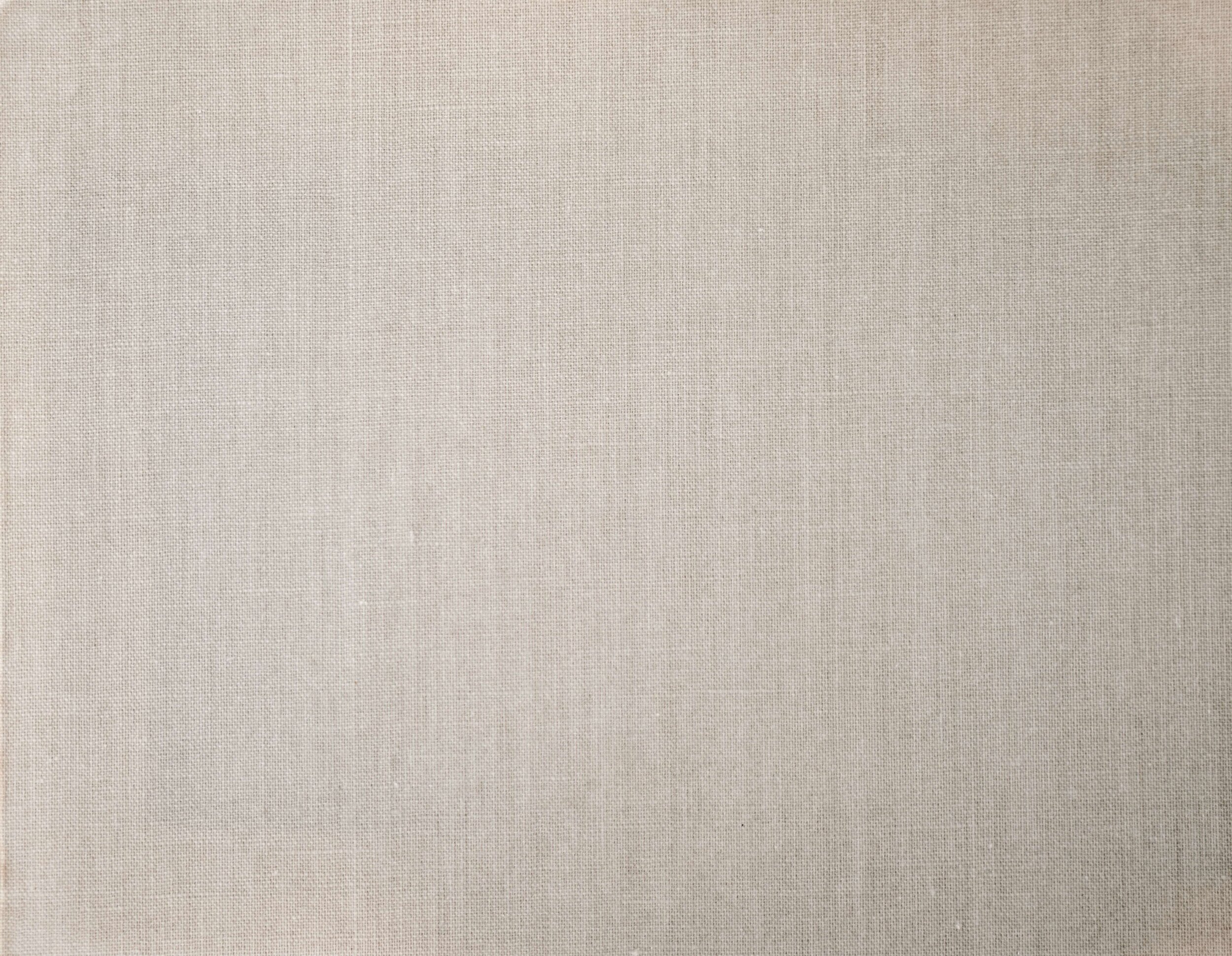

I typically also in the final package provide some textures and background images to clients to help kick off their social media with a vibe. In this case, some lavender buds, a creamy linen (which always says farm to me) and some macro buds.
PATTERNS


Depending on the brand, patterns are also included with custom designs. Here, I created some patterns for my clients with the elements from their logo design.
FINAL LOOK


This may have been one of my favourite projects to work on as it required collaboration, simplicity, timeless designs and who doesn’t love working with flower shapes. I highly recommend you visit Lochland Botanicals to experience the farm for yourself
