

Boutique Marketing Company Brand Design
Meeting years earlier at a shoot, I was flattered when Michelle from Method & Motion reached out to me for help with her and business partner Sarah’s brand identity for their marketing firm based in Toronto.
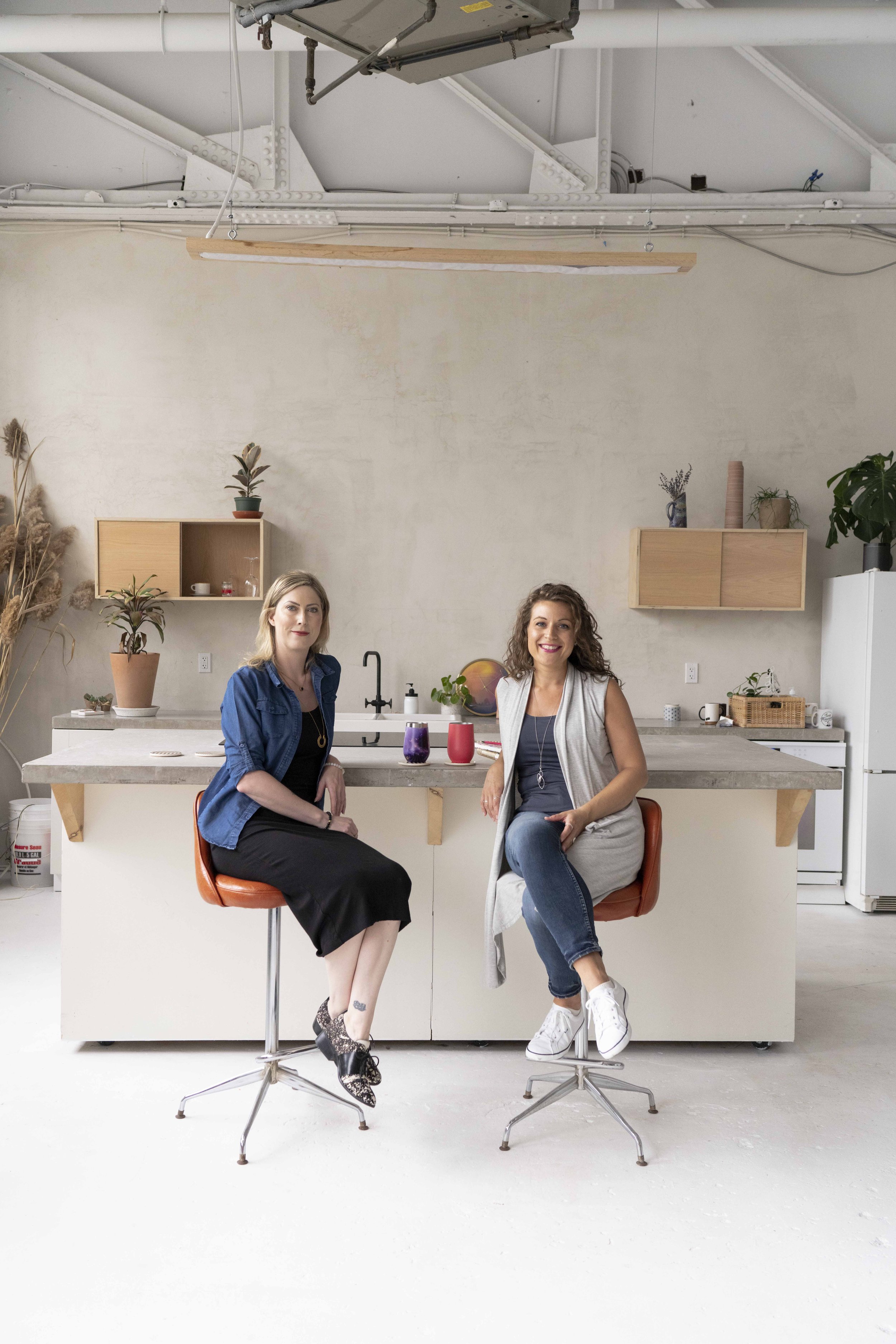
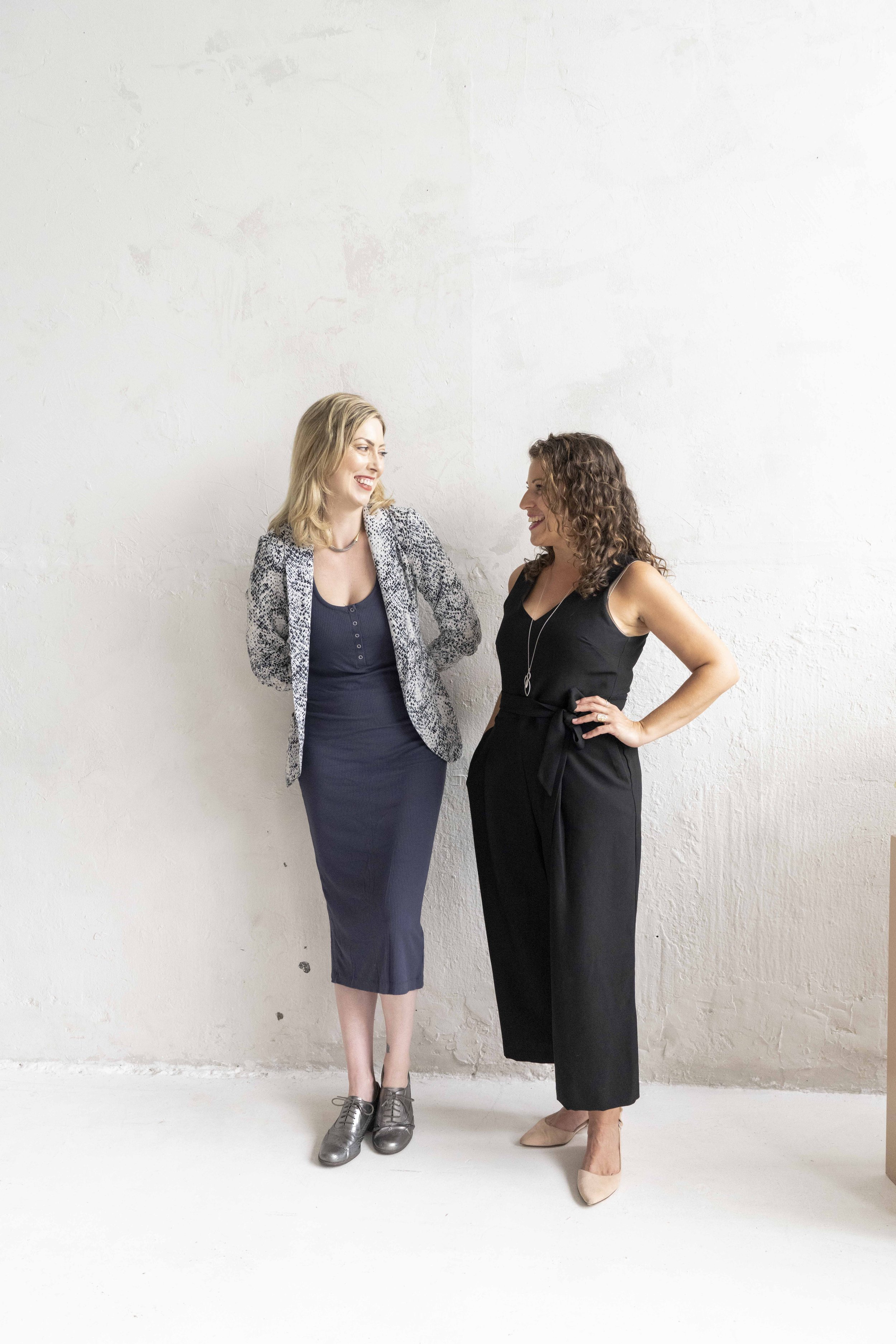
For Method and Motion’s brand design, these women were spot on with their vision for the outcome. They were in the market for a logo, website and brand photography, but they knew they did not want cookie cutter. They wanted something that popped that you don’t see everyday. We played with tons of font options until the perfect one landed, and then we customized that further for them. Next, we did a branding photoshoot at Fieldwork Studio downtown Toronto which was a great mix of urban and fun with lots of wall texture to go with their site. What was next? You guessed it, Squarespace website build time. This is where the brand design, brand photoshoot and of course my beloved Squarespace came together with lots of added CSS customizations to make the site as unique as their brand.
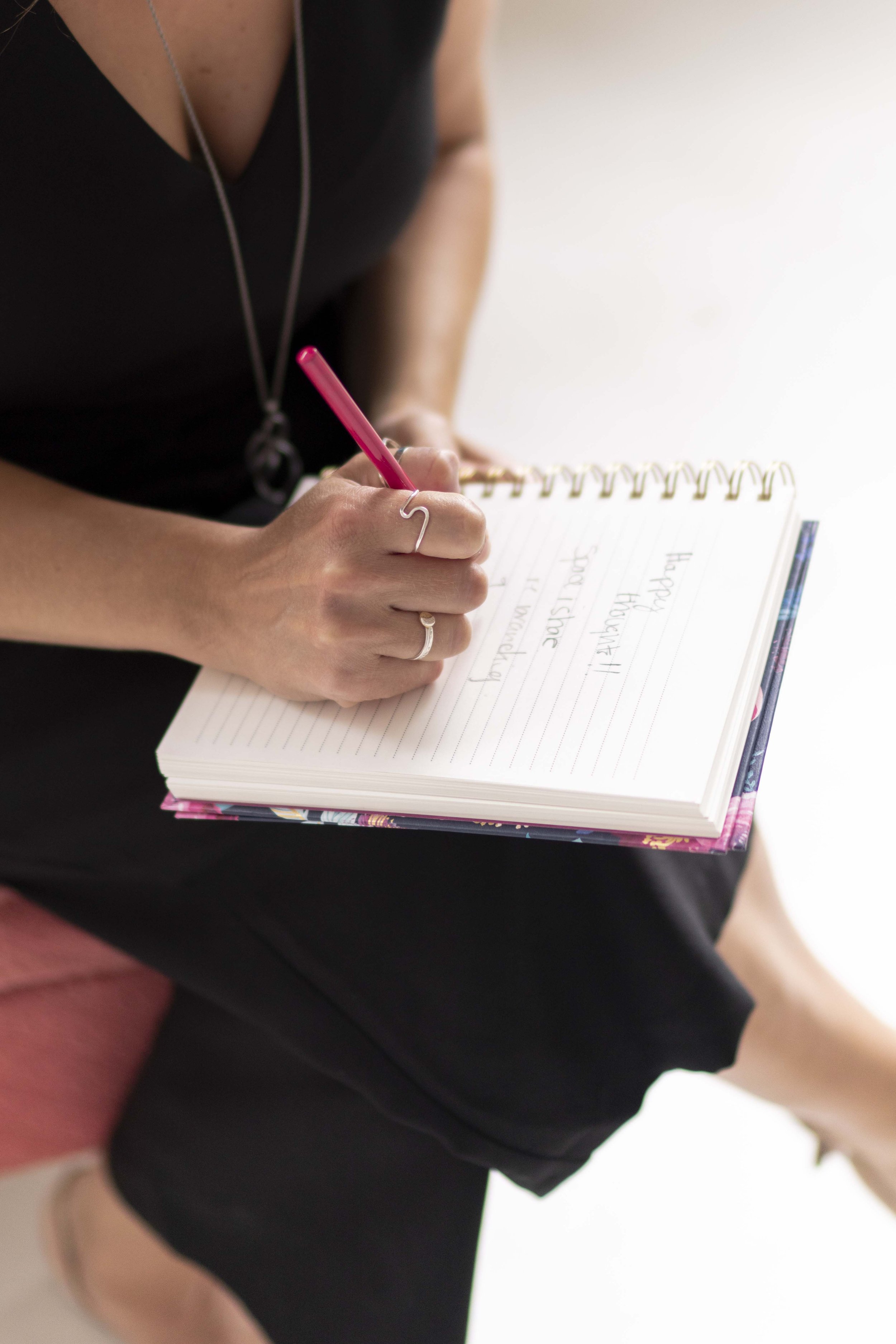
Method and Motion wrote all of the fun copy that you will see on their site and incorporated an amusement park/ride theme to their communication. Some of the background and social graphics they will be using will play on that theme. We weaved some of the amusement park elements into their website design to match. I love the out of the box approach to their marketing business and how every client that comes to them has different marketing needs that they can deliver a la carte so I am so proud that we could provide a brand to keep up with that tone.
MOOD BOARD & LOGO DESIGN

For this brand identity mood board, I was trying to combine elements that spoke to me. We aimed for women owned but not overly feminine and punchy colours while being welcoming and collaborative.

We used a vintage style font for their logo with interesting curved elements that wasn’t too “cursive” we landed on this as our final design with the burst as an add on and stand alone element.

I always mock up a client’s logo in a single colour. The storefront/office sign is my favourite way to do that.
SQUARESPACE WEBSITE BUILD
We continued the amusement ride theme into their Squarespace Website Design. Squarespace is my preferred platform for websites hands down. It is the only one I use. I love the user friendliness and versatility for my clients. As you can see below, the site looks great on all screen sizes and translates well to each without design compromise. There was lots of customization for this site design/build, from the background gradients and bursts to incorporating their logo and the custom ride icons throughout the site. They have gone on to build out their blog really well on their own post site build which is always so awesome to see.

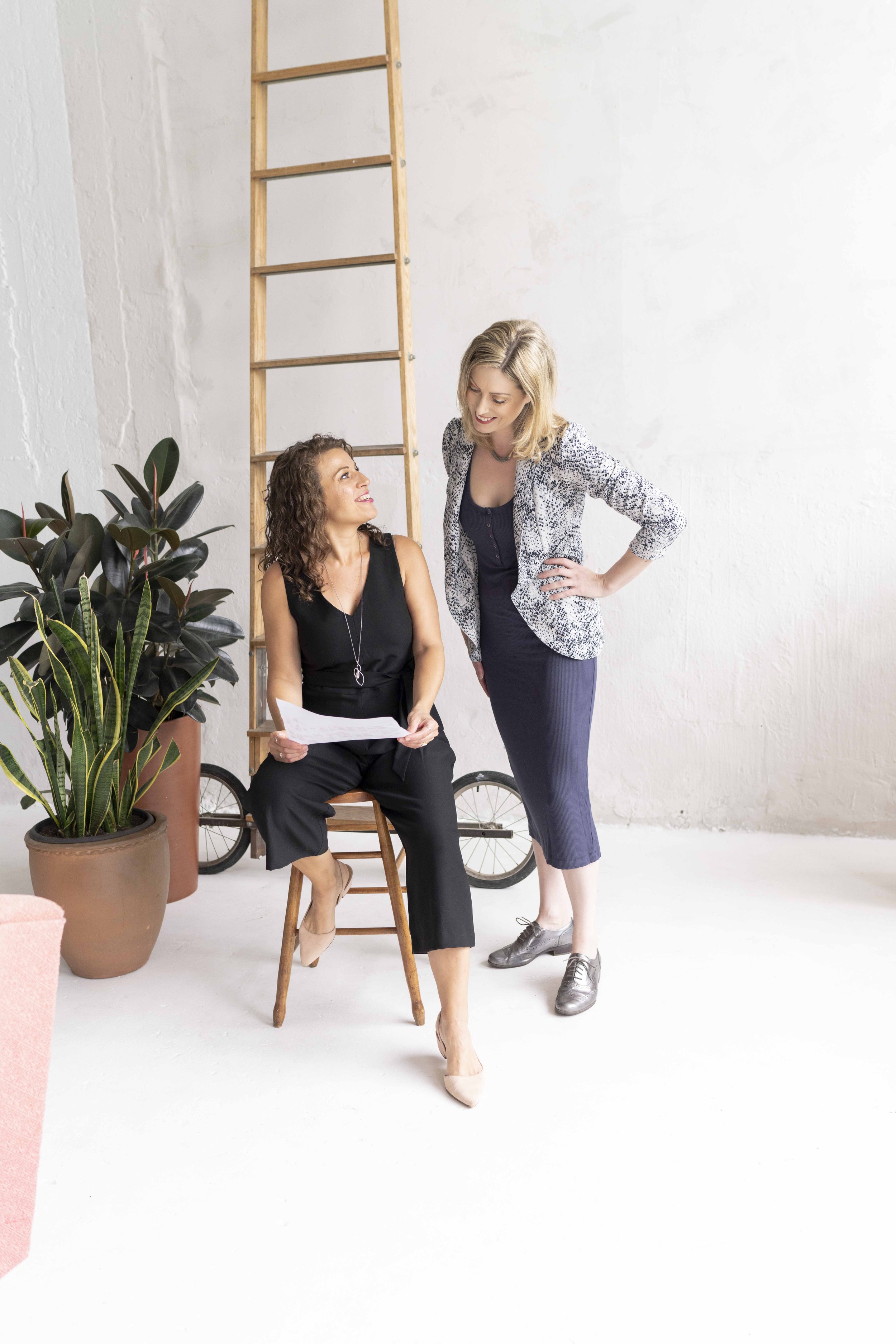
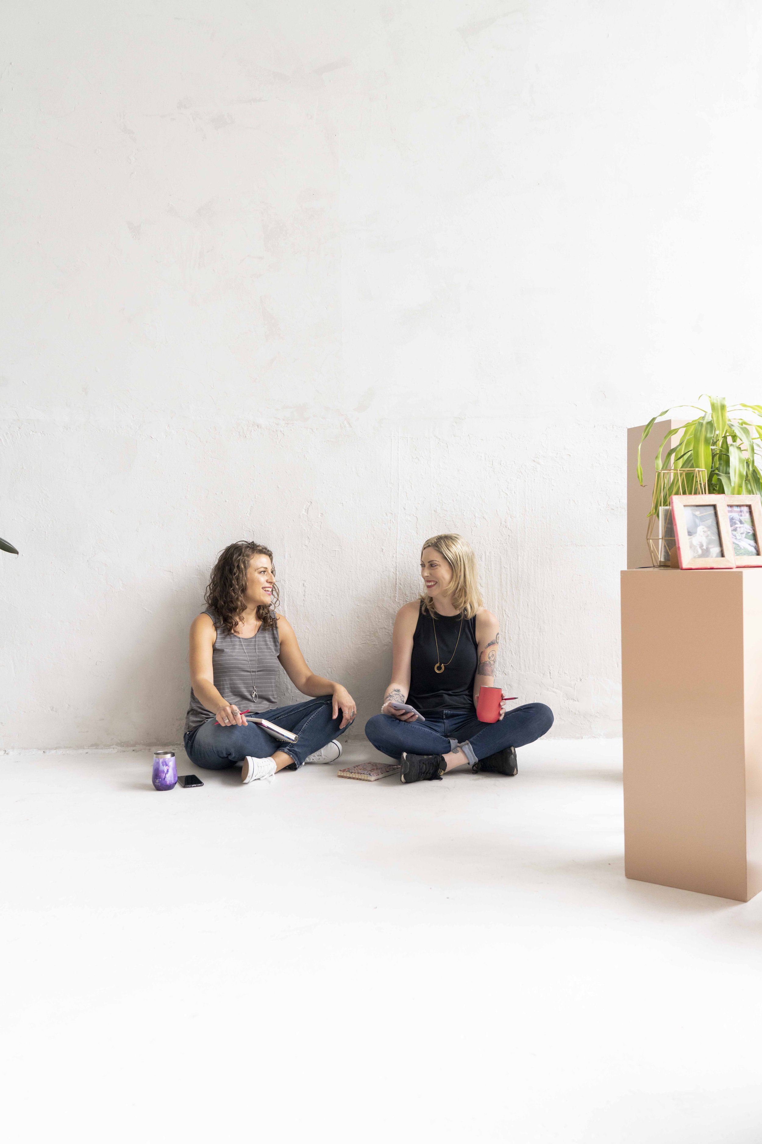
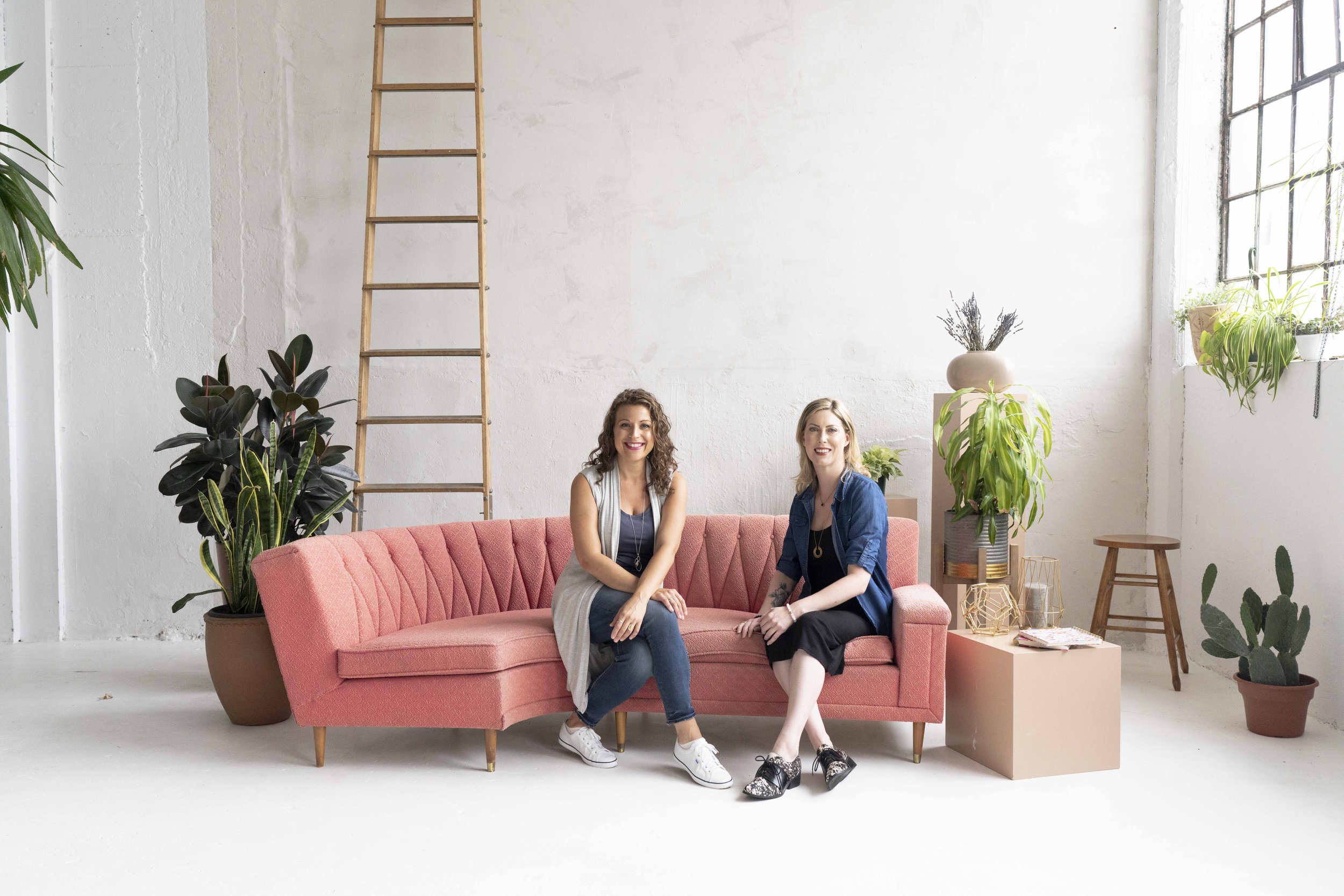
PHOTOSHOOT
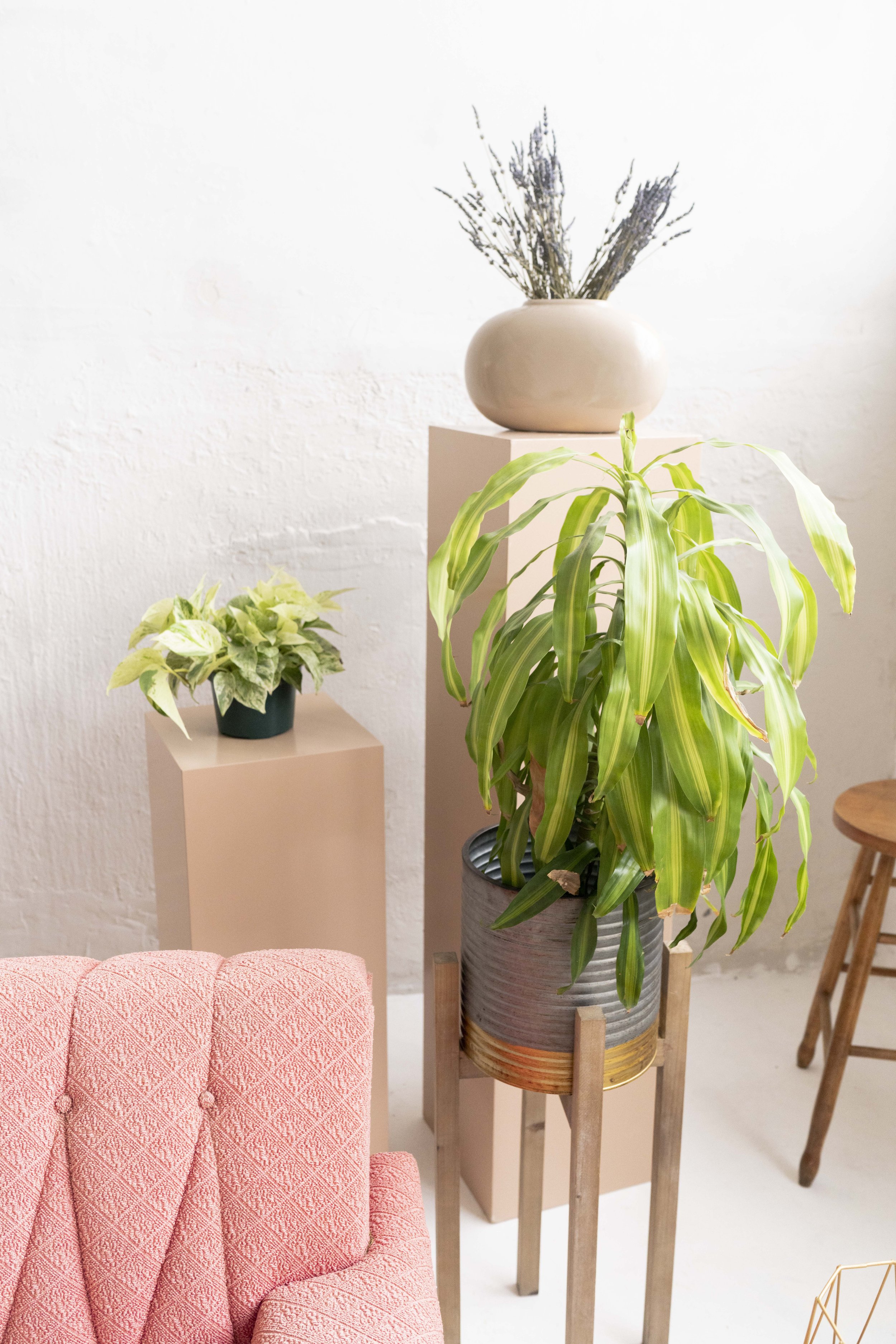
We knew we needed a cool space in Toronto to shoot in for this brand. Fieldwork Studio is just that, and the coral toned couch was perfection with their brand colours. I love how the brand photoshoot is always the icing on the cake and sweetens the whole picture, because as you know, your brand is you and your audience wants to see that.
FINAL THOUGHTS
I love working with ambitious women in business and this case was NO exception. Being able to combine all of my skills in brand photography, brand design and Squarespace design to bring this amazing women owned business to life hits the nail on the head for what my business is all about.
If you want to see another project that lights me up, check out Lochland Botanicals brand design.
